C A S E S T U D Y 4 : W I R E F R A M E I T E R A T I O N
A major factor in creating strong UX design solutions is the ability to iterate and refine ideas throughout the design process. Taking feedback and ideas from other team members and implementing them where appropriate can result in a better final product.
This project focused on designing a mobile and desktop platform for a college film studies department. The students and inventory managers were struggling to find a way to keep equipment rentals organized and efficient. For the purposes of this assignment, I was tasked with creating designs that focused on the Inventory Manager as a target user.
WHAT WE KNOW ABOUT THE INVENTORY MANAGER:
it is challenging and laborious to manually check in and out equipment using paper forms
it is challenging to keep track of overdue items and notify students
it is challenging to keep track of things on the paper system
The things that needed to be included in the design were:
the ability to add delete and update items in the inventory
log lost/damaged equipment
be able to monitor and track checked in and checked out equipment
see overdue items
notify users of overdue items
notify users of any inventory changes or post other announcements
With all of this past knowledge we started out by creating low fidelity sketches of three homepage options.
We received peer and instructor feedback on our wireframe options. My main peer feedback was that having categories for items would be more useful for users. It would help them to avoid scrolling through everything to find what they need. My peer also liked having everything at a glance and each element on individual cards made for a simple easy to navigate UI. For this new iteration, I tried to combine my previous homepage one and two to come up with a more organized layout that is not overwhelming or cluttered. Other feedback included the considerations of proximity and find ability. With this in mind, I moved the ‘add new item’ action to be directly above the item list. This positions it for easy access to the area that it is related to.
In addition to a revised homepage layout, I proposed a task flow for inventory managers to add new items to the site. The goal of the task flow was to create a simple way for them to add new items to the inventory. This was done though creating a flow with minimal steps. The user only has to enter in necessary information and hit okay. To provide an easy way to keep track of inventory, a barcode is produced that can be scanned in for easy tracking. The user also has an option to continue to add more items or to finish with the task and return to the homepage. This allows for users to skip a step instead of having to redo a repetitive action multiple times as they add in multiple items.
Below are annotated wireframes of the above sketches.
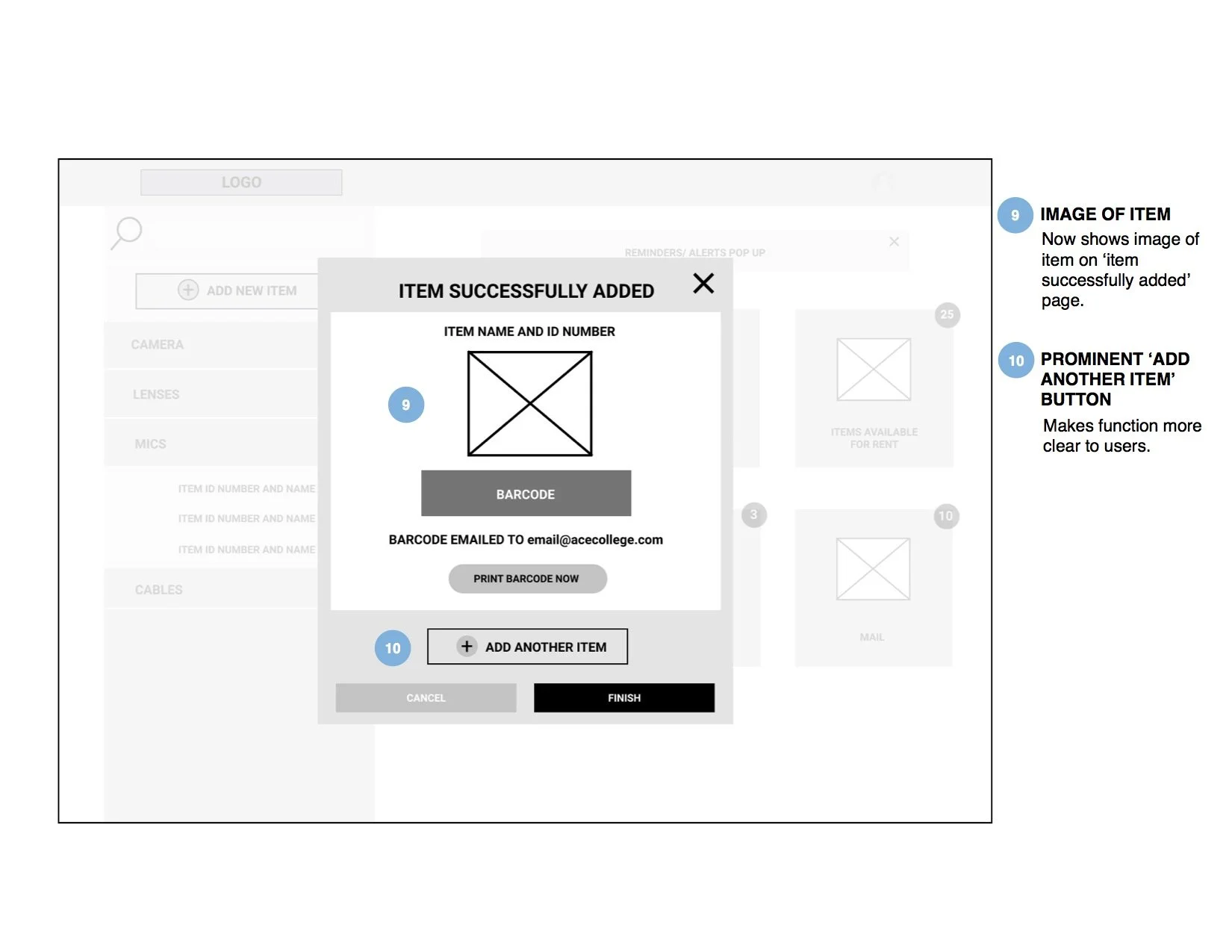
Another set of peer and instructor review helped refine these wireframes and provided a clear structure for the mobile version. Peer feedback had pointed out that there was no option to include an image when uploading a file. This is certainly an important feature and I revised the next iteration to reflect that. Additional feedback included suggestions about reducing the clutter by implementing a hidden menu. This was added to the new iterations to make the necessary information available to users when they need it. Labeling choices were also mentioned. It was suggested that the ‘OKAY’ call to action button may be better represented as ‘NEXT’ in order for the user to understand where they are in the process. Other considerations including use of space and visibility which were all worked on for the new wireframes.
The revised wireframes can be seen below.
With all the information collected through previous iterations, a mobile version of the interface was developed.
Annotated wireframes of the above sketches are below.
This concluded the deliverables for this assignment. It was clear that as the project progressed with each iteration, the design became better and more useful for the user. I believe that feedback is such an important part of developing strong UX solutions and the evolution of this project is a good example of that.


